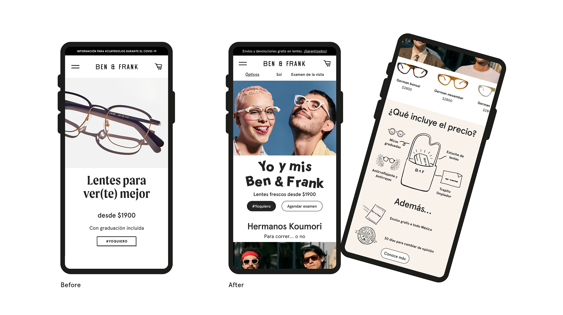


Home redesign
Background:
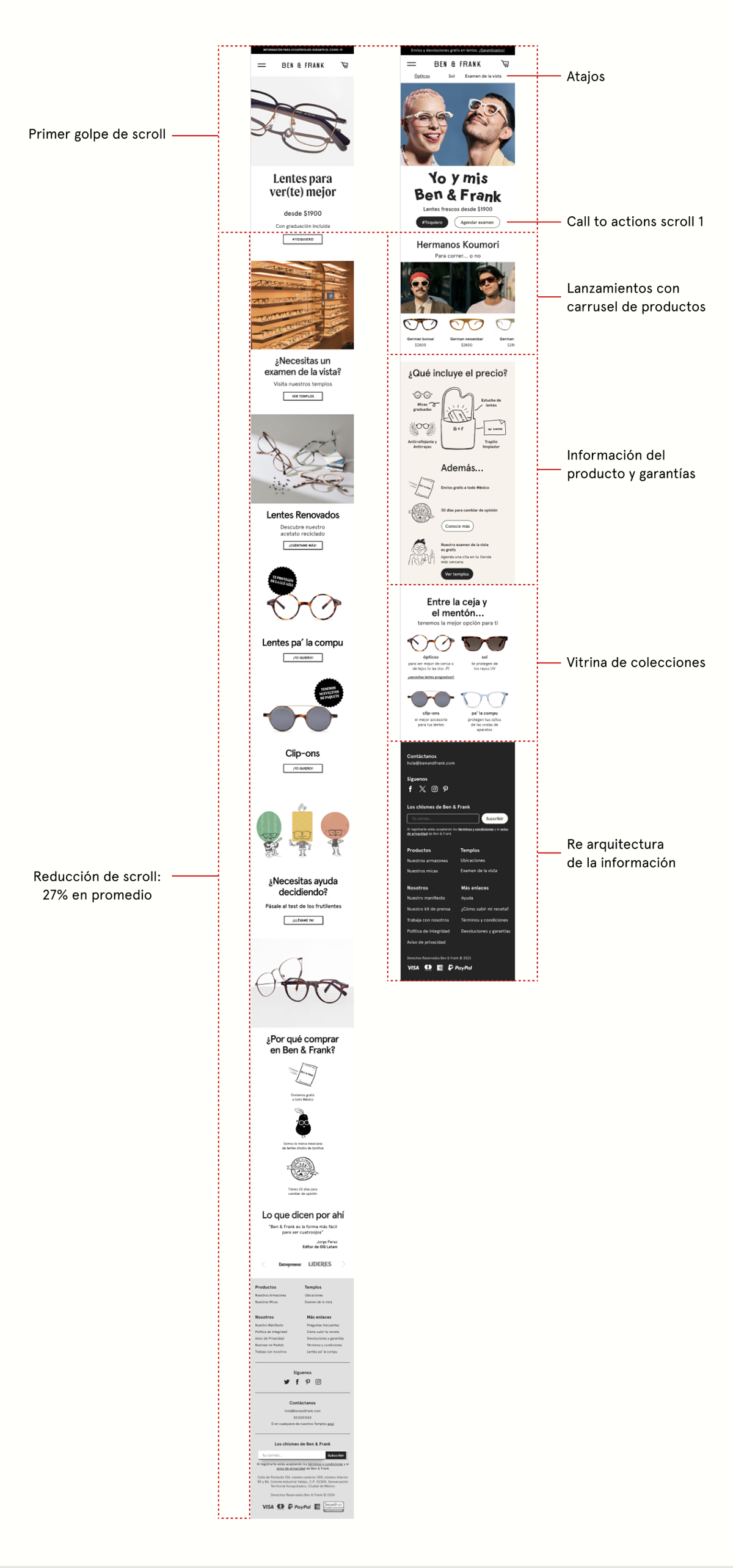
Out of an average of three million users, only 30% complete a full scroll through the page. Assuming that a shorter scroll with the right information could lead to a higher jump to the next funnel and increase the likelihood of conversion to a purchase.
Objectives:
- Significantly reduce the scroll
- Show the most important information on the initial visual load
- Create an identification with younger people
- Drive higher conversion to purchase
Solutions:
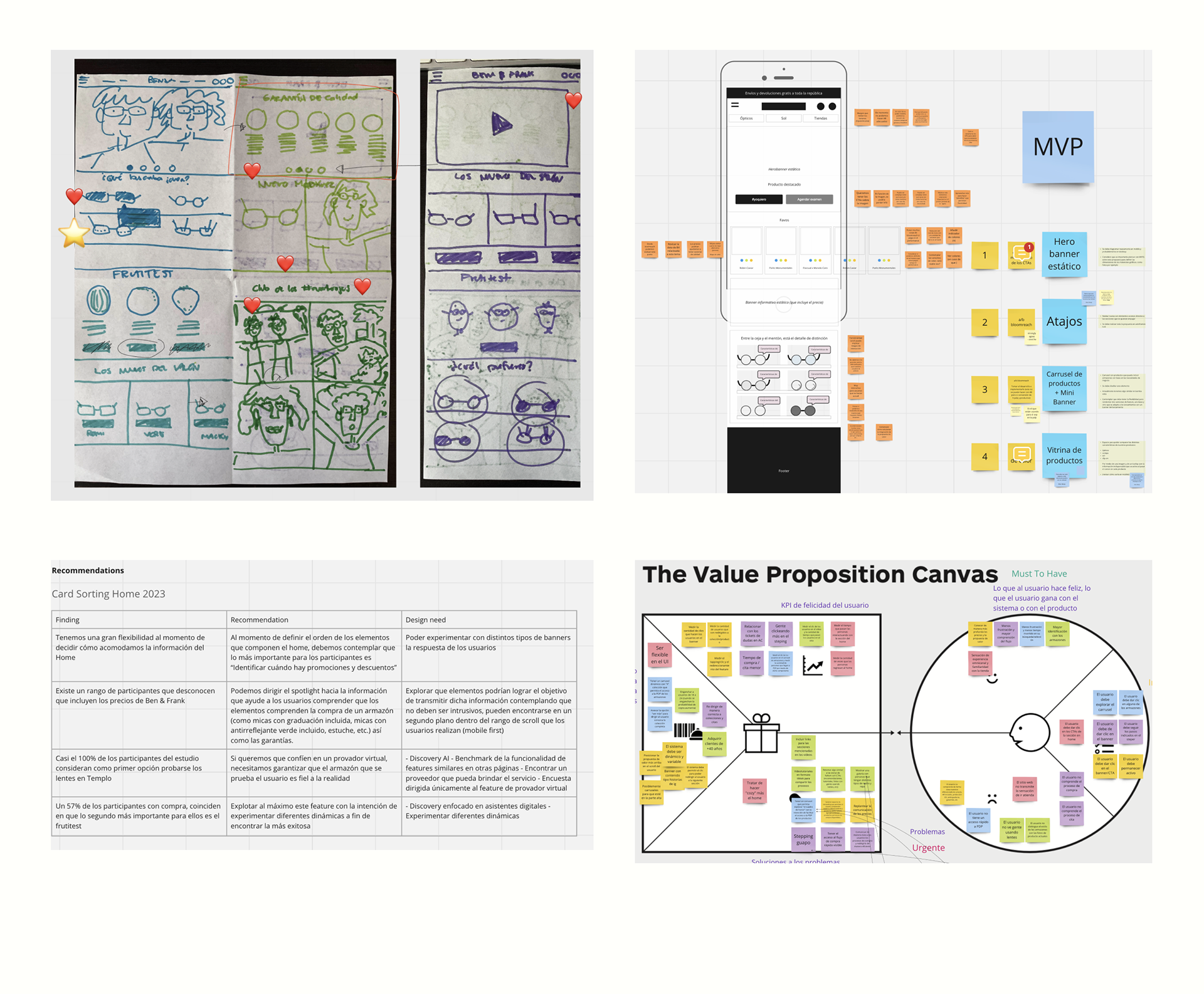
Analyzing previous information and historical changes in the main flow, it was decided to prioritize information based on the results of launched surveys, generating proposals with synthesized and valuable information for the user, aiming to achieve a more organic navigation with the support of:
- Card sortings
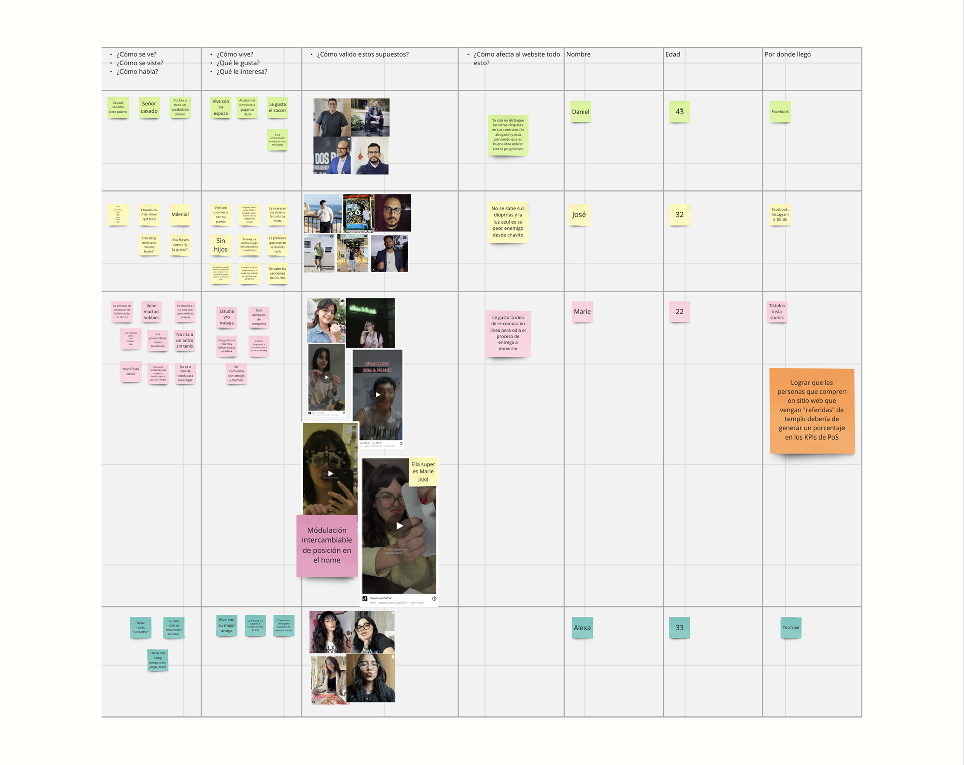
- Update of user personas
- Design sprint
- Low and high-definition wireframes
- Effectiveness metrics from the redesign
